Workspace Policy Feature Added
A new "Workspace Policy" setting has been added, allowing you to centrally manage security policies across your entire workspace.
What's new
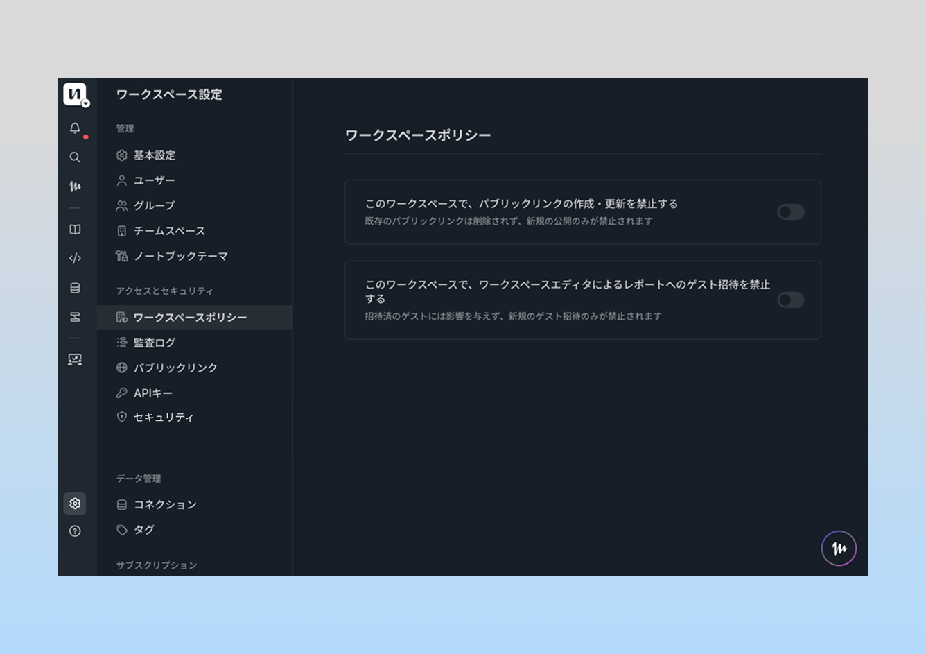
A "Workspace Policy" page has been added to workspace settings. Users with owner permissions can manage policies that apply across the entire workspace using simple toggles.
The newly added policy is "Disallow guest invitations by editors to reports". When this policy is enabled, members with editor permissions will no longer be able to invite guests to reports, centralizing external sharing control to owners only.
Use cases
This prevents the risk of reports containing sensitive internal data being unintentionally shared externally by members with editor permissions. By centralizing external sharing to owners, it becomes easier to enforce data governance policies and meet compliance requirements.
Workspace Policy is available on the Enterprise plan only. Please contact us if you'd like to use this feature.
※Specifications are subject to change without notice.
We hope this helps strengthen your data management and security!
We'd love to hear your feedback and feature requests.